Adventure Camp
Built a camp booking experience with structured content for multiple age groups and activity types. Created reusable hero sections, activity cards, and booking flows that scale across different programs while maintaining visual consistency.
Objectives
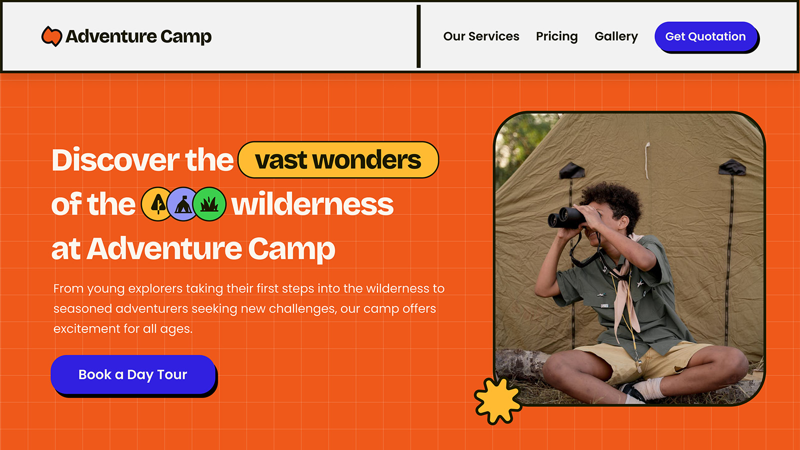
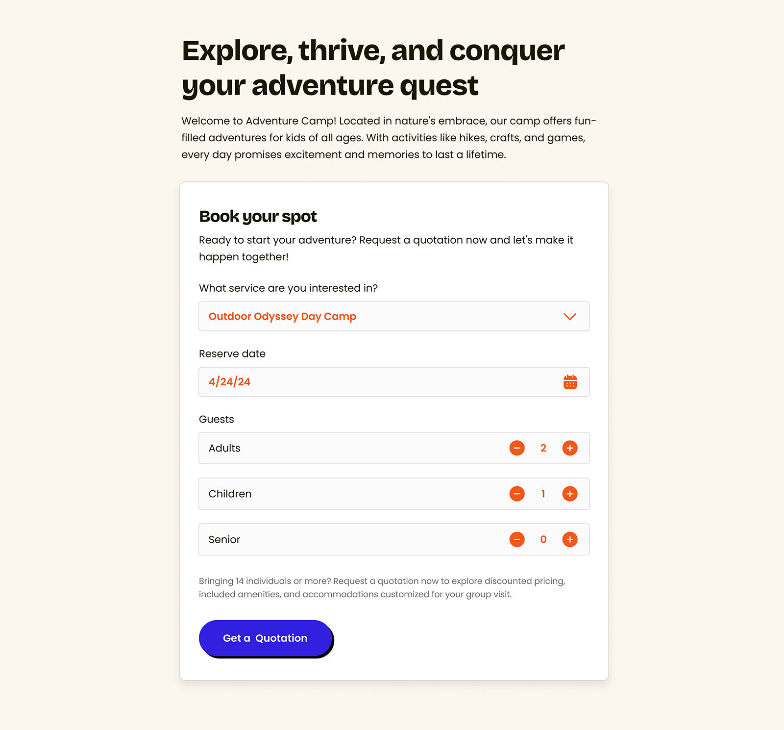
This personal project is designed for young explorers, aiming to make their journey exciting, fun, and creative. The website features the color yellow as its primary hue, bringing a vibrant and energetic feel. To further engage the young and young-at-heart audience, we’ve embraced the Neubrutalism UI design style, making the user experience both engaging and fun.
Role
Tools and Technologies


Approach
The design approach for Adventure Camp embraces the Neubrutalism UI design style, known for its bold, creative, and unconventional aesthetics. This makes it perfect for younger audiences who are seeking a thrill and adventure. The vibrant and daring design is sure to captivate and engage young explorers, inviting them into a world of excitement and discovery. To create an engaging and user-friendly experience, Adventure Camp will implement a multi-faceted design strategy:
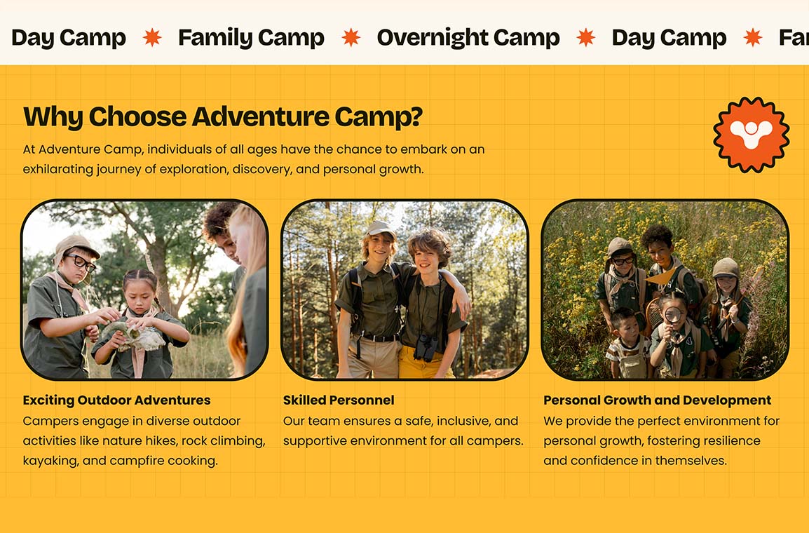
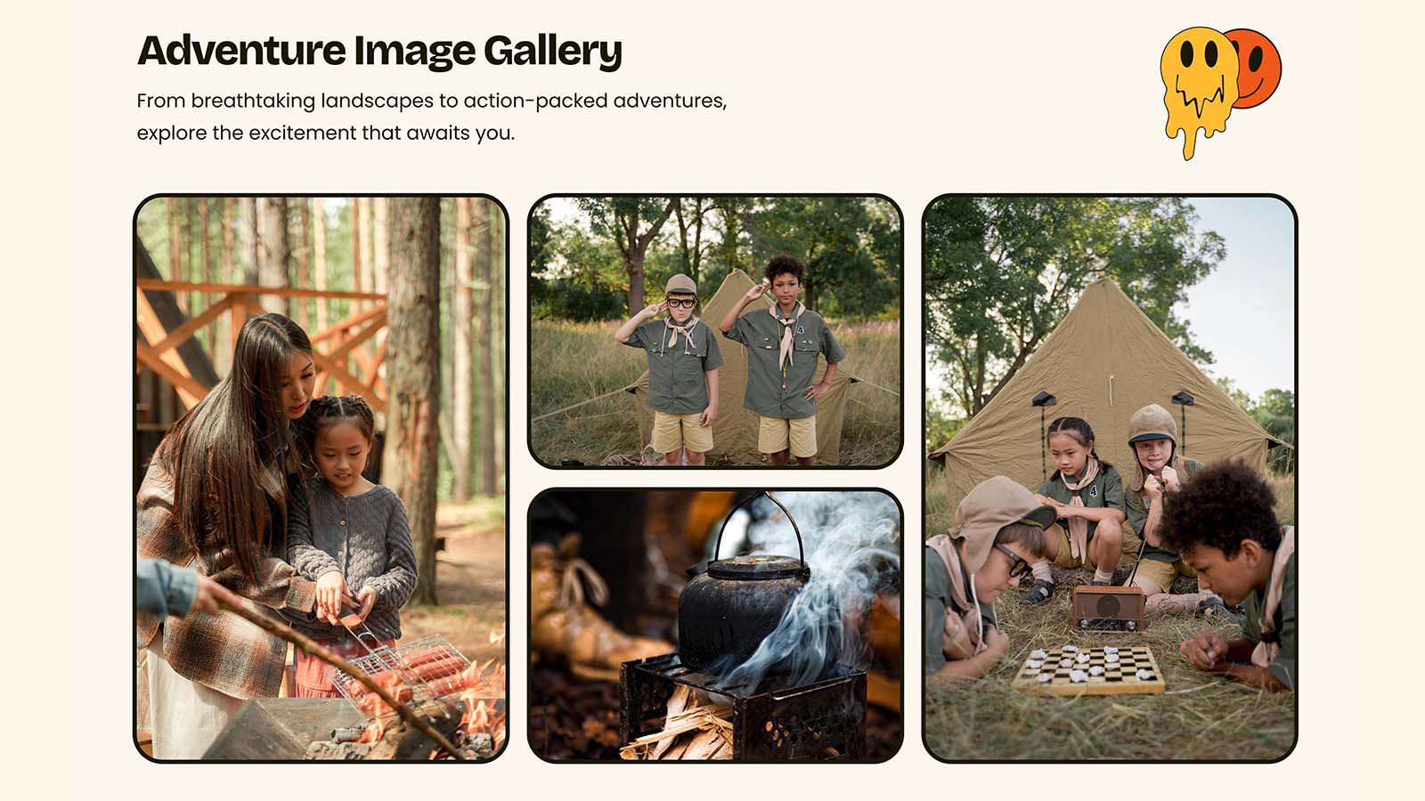
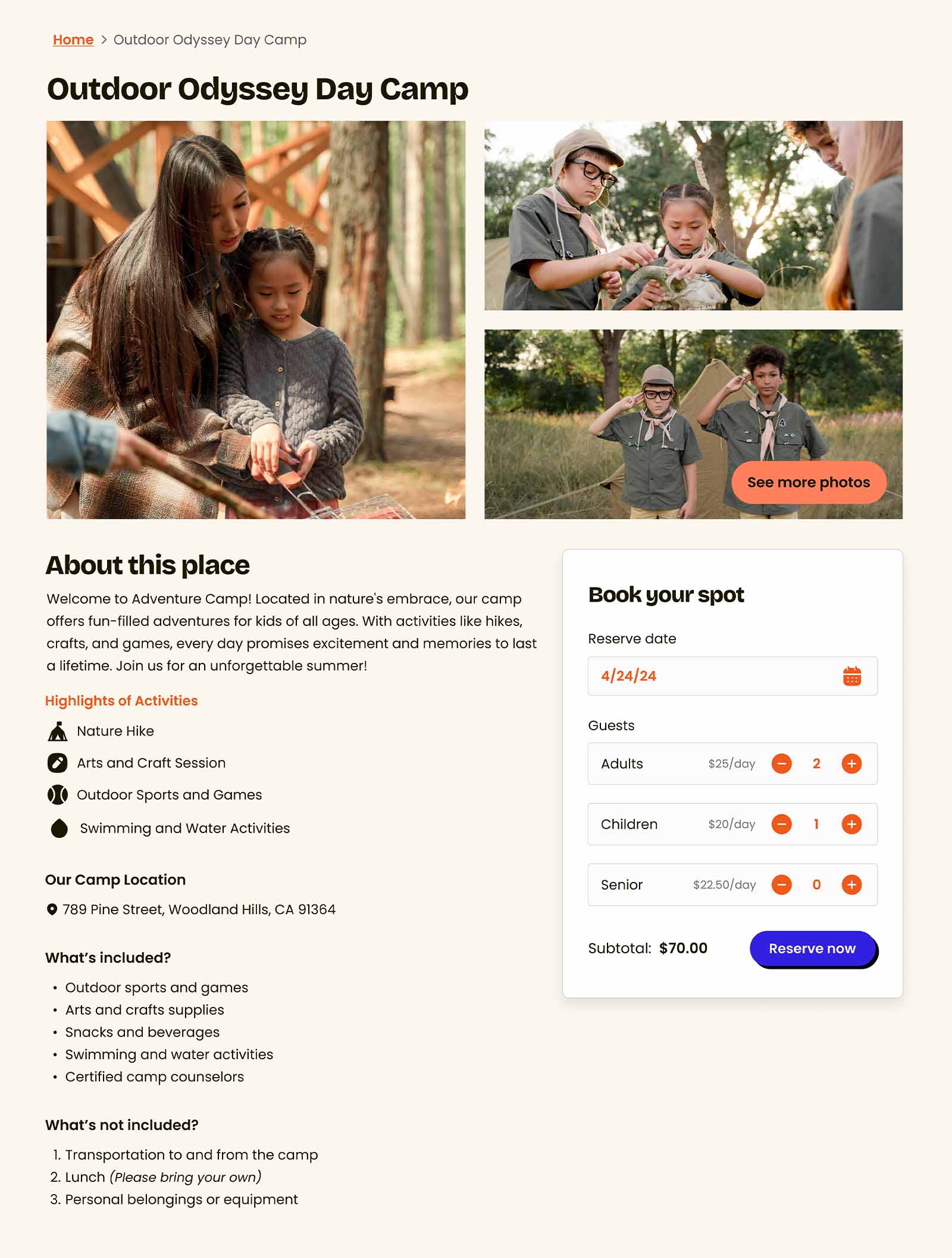
- Immersive Visuals: Incorporating high-resolution images and videos of camping activities, scenic landscapes, and group adventures to inspire visitors and evoke the excitement of exploration.
- Simplified Navigation: Designing a clear, top-level navigation bar with sections for Gallery, Services, Pricing, and Quotation to ensure seamless access to essential information.
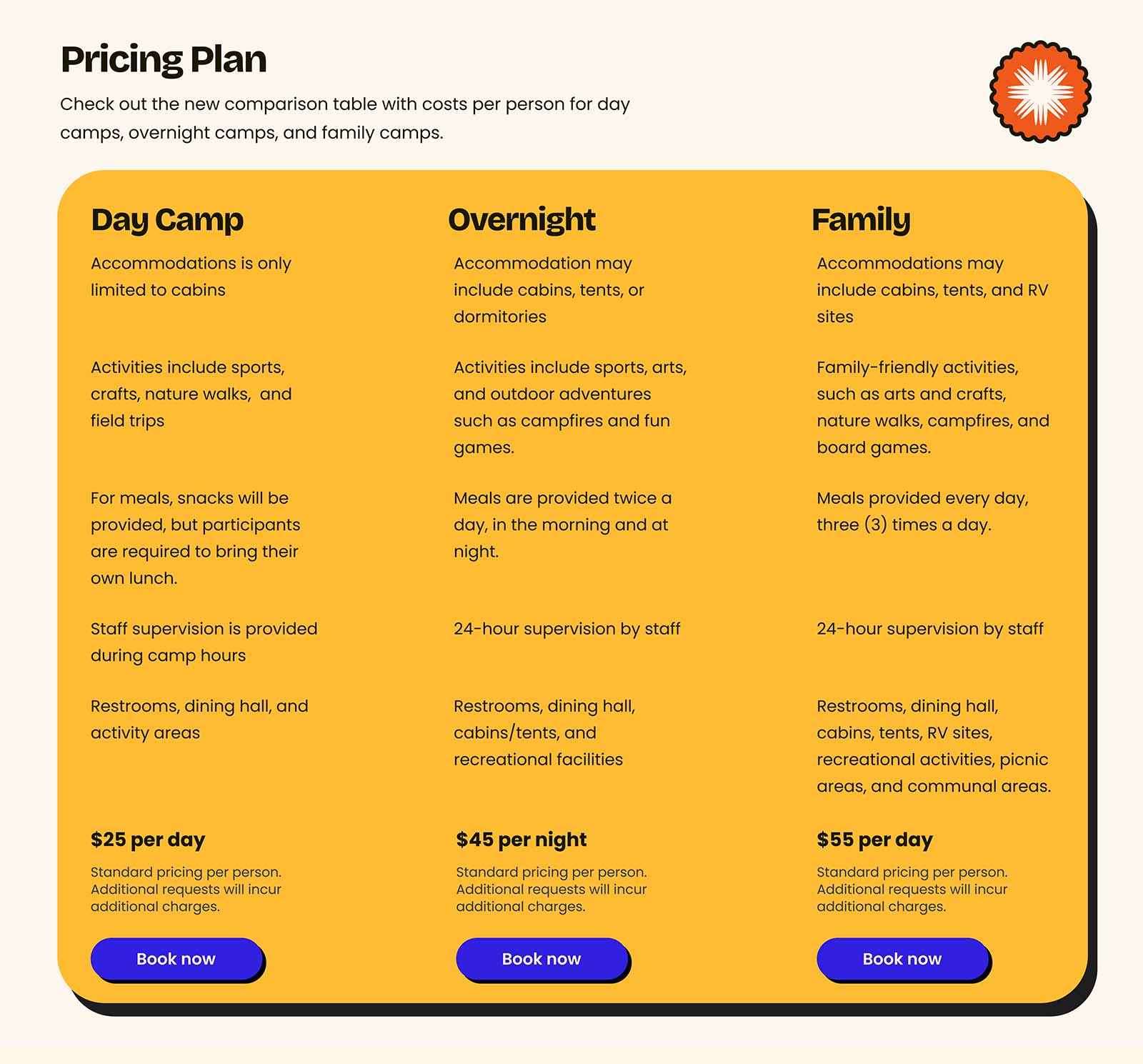
- Transparent Pricing: Displaying clear, easy-to-understand package details and inclusions to build trust and simplify decision-making.
- Personalized Quotation: Offering an intuitive form that allows users to select camp types, group sizes, and dates for tailored quotes, making it easy to plan their adventure.
Design Process
Whenever I create a web design, I typically begin by identifying direct competitors. Since working at startup companies often means limited time for comprehensive user research, conducting a competitor analysis is the next best approach.
If the company already has dedicated brand guidelines, competitor analysis and an inspiration board are usually already done, allowing me to move directly to creating wireframes. However, if there are no dedicated brand designers, I start by creating an inspiration board and establishing a quick color hierarchy to ensure consistency, even in the absence of formal branding.

Once the inspiration board and color hierarchy are set, I typically skip the traditional low-fidelity wireframes, as they can be time-consuming. Instead, I move directly to creating mid-fidelity to high-fidelity wireframes, which closely resemble the final product.
This approach saves time and allows me to focus on delivering the final output more efficiently. Rest assured, skipping the low-fidelity wireframes does not compromise the quality of the final design. I ensure that every step is carefully executed to maintain the integrity and effectiveness of the design.

Style Guide Creation
If everything goes smoothly and no additional revisions are needed, a style guide is prepared. This style guide is used by developers to ensure the website's appearance and functionality are consistent. It includes details on color usage, grid system, typographic scale, and components in various states. This comprehensive guide helps maintain a cohesive and polished final product.
Features and highlights
Immersive Visuals
- A captivating gallery showcasing breathtaking landscapes, dynamic action shots of campers, and heartfelt moments of connection, designed to transport visitors into the Adventure Camp experience and spark their sense of adventure.
Transparent Pricing
- Clear and concise package breakdowns, featuring visually appealing comparison tables and highlights of inclusions, ensuring potential campers feel confident and informed in their decision-making process.
Personalized Quotation
- An intuitive and visually engaging form where users can select camp types, group sizes, and dates, accompanied by helpful visuals and prompts to make planning their adventure seamless and exciting.
Detailed Service Description
- A comprehensive breakdown of all camping experiences, designed to help users fully understand what Adventure Camp offers. Each service includes clear and engaging descriptions of activities, accommodations, and amenities, tailored to different camp types—Day Camps, Overnight Camps, and Family Camp.
Heatmap Summary
Page speed
Related Design Project

Adventure Camp
Design a scout and camping tour brimming with activities for every age group. From thrilling nature hikes and rock climbing to serene stargazing and campfire stories, we’ve crafted the perfect adventure.
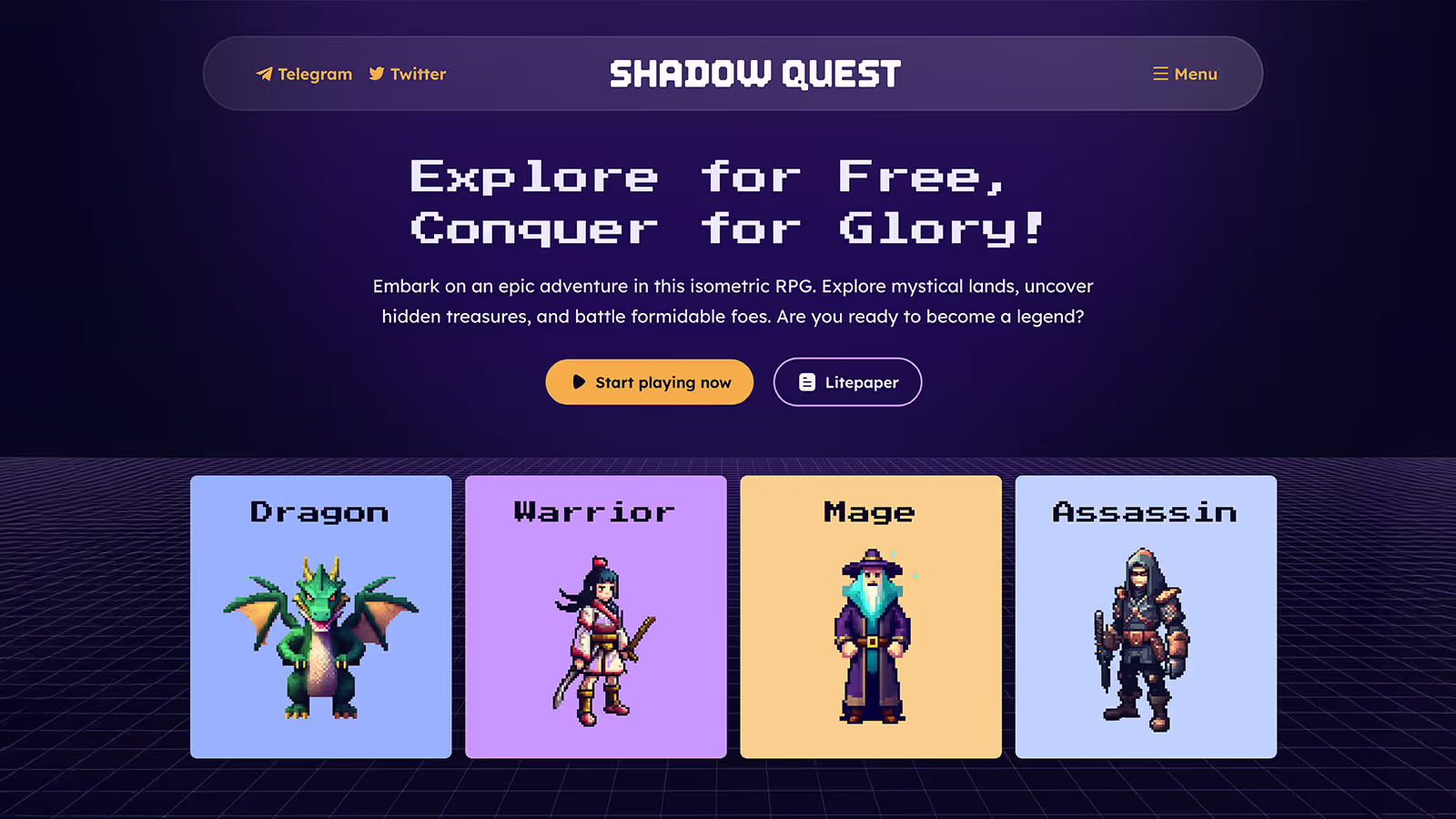
Shadow Quest
Shadow Quest is a free isometric RPG where you’ll explore mystical lands, uncover treasures, and battle fearsome foes, all with a striking Dark UI and stunning isometric visuals.
Pixel Pro
Pixel Pro Digital Agency is all about bringing bold ideas to life. I combine creative design, smart strategies, and custom digital solutions to help brands stand out.
Everbloom Mockups
Create a variety of mockups for Everbloom that showcase its products in a visually compelling way while maintaining a perfect balance between a premium aesthetic and an inviting, approachable feel.
Product Composites
Create a visually compelling product composite by seamlessly integrating the mockup with the background, ensuring a natural and realistic presentation that enhances the overall appeal.

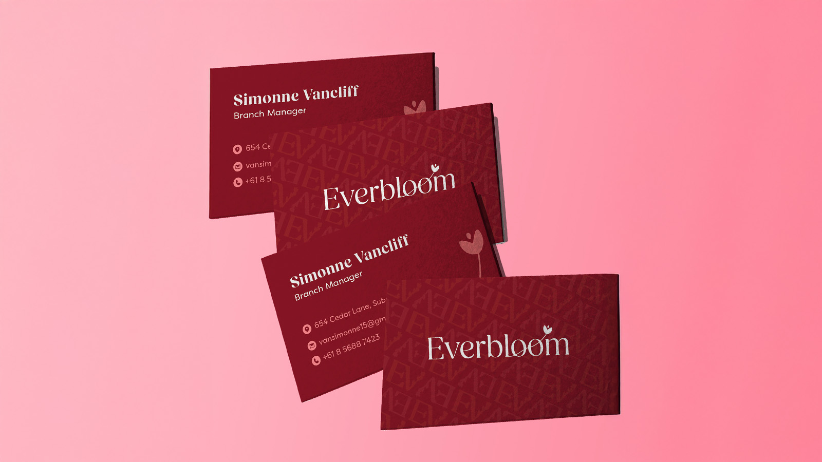
Business cards
Create a business card that incorporates elements of bold typography and luxurious design, offering a unique and sophisticated brand representation.
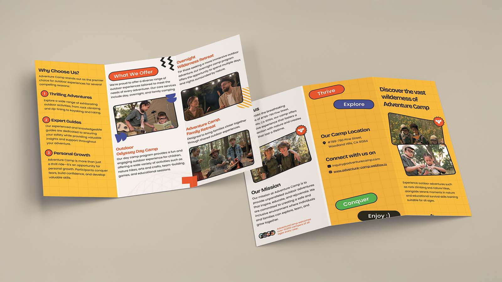
Adventure Camp Brochure
Design a vibrant tri-fold brochure that seamlessly blends bold visuals with a fun, energetic feel—perfectly capturing the adventurous spirit of the Adventure Camp brand while keeping it engaging and easy to navigate.

Personal Portfolio
Hey, I’m John! I design websites that look great and feel effortless to use. My portfolio showcases a balance of aesthetics and usability, ensuring seamless experiences for users.